Note
Click here to download the full example code
Comparing categorical variable visualizations
This example showcases the four types of visualization supported for categorical variables for classification, which are ‘count’, ‘proportion’, ‘mosaic’ and ‘sankey’.
from dabl.plot import plot_classification_categorical
from dabl.datasets import load_adult

data = load_adult()
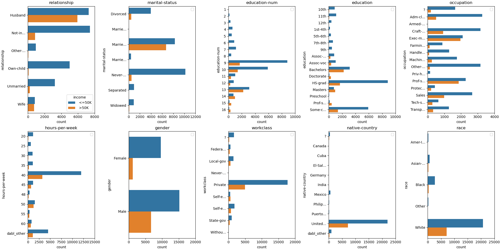
The ‘count’ plot is easiest to understand and closest to the data, as it simply provides a bar-plot of class counts per category. However, it makes it hard to make comparisons between different categories. For example, for workclass, it is hard to see the differences in proportions among the categories.
plot_classification_categorical(data, target_col='income', kind="count")
array([[<AxesSubplot: title={'center': 'relationship'}, xlabel='count', ylabel='relationship'>,
        <AxesSubplot: title={'center': 'marital-status'}, xlabel='count', ylabel='marital-status'>,
        <AxesSubplot: title={'center': 'education-num'}, xlabel='count', ylabel='education-num'>,
        <AxesSubplot: title={'center': 'education'}, xlabel='count', ylabel='education'>,
        <AxesSubplot: title={'center': 'occupation'}, xlabel='count', ylabel='occupation'>],
       [<AxesSubplot: title={'center': 'hours-per-week'}, xlabel='count', ylabel='hours-per-week'>,
        <AxesSubplot: title={'center': 'gender'}, xlabel='count', ylabel='gender'>,
        <AxesSubplot: title={'center': 'workclass'}, xlabel='count', ylabel='workclass'>,
        <AxesSubplot: title={'center': 'native-country'}, xlabel='count', ylabel='native-country'>,
        <AxesSubplot: title={'center': 'race'}, xlabel='count', ylabel='race'>]],
      dtype=object)
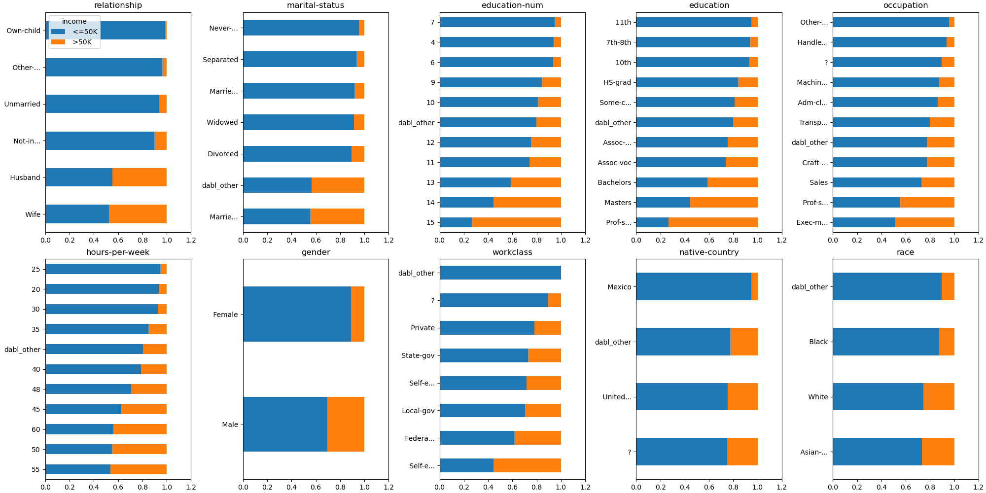
The ‘proportion’ plot on the other hand only shows the proportion, so we can see that the proportions in state-government, government, and self-employed are nearly the same. However, ‘proportion’ does not show how many samples are in each category. How much each category is actually present in the data can be very important, though.
plot_classification_categorical(data, target_col='income', kind="proportion")
array([[<AxesSubplot: title={'center': 'relationship'}>,
        <AxesSubplot: title={'center': 'marital-status'}>,
        <AxesSubplot: title={'center': 'education-num'}>,
        <AxesSubplot: title={'center': 'education'}>,
        <AxesSubplot: title={'center': 'occupation'}>],
       [<AxesSubplot: title={'center': 'hours-per-week'}>,
        <AxesSubplot: title={'center': 'gender'}>,
        <AxesSubplot: title={'center': 'workclass'}>,
        <AxesSubplot: title={'center': 'native-country'}>,
        <AxesSubplot: title={'center': 'race'}>]], dtype=object)
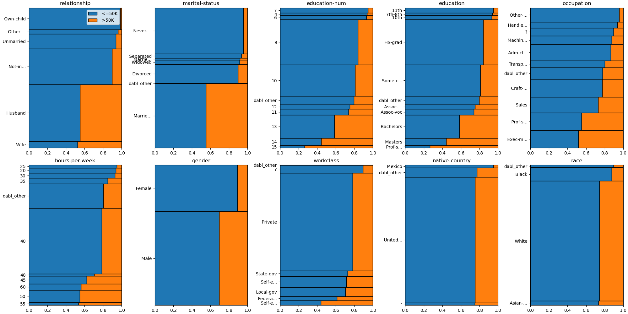
The ‘mosaic’ plot shows both the class proportions within each category (on the x axis) as well as the proportion of the category in the data (on the y axis). The ‘mosaic’ plot can be a bit busy; in particular if there are many classes and many catgories, it becomes harder to interpret.
plot_classification_categorical(data, target_col='income', kind="mosaic")
array([[<AxesSubplot: title={'center': 'relationship'}>,
        <AxesSubplot: title={'center': 'marital-status'}>,
        <AxesSubplot: title={'center': 'education-num'}>,
        <AxesSubplot: title={'center': 'education'}>,
        <AxesSubplot: title={'center': 'occupation'}>],
       [<AxesSubplot: title={'center': 'hours-per-week'}>,
        <AxesSubplot: title={'center': 'gender'}>,
        <AxesSubplot: title={'center': 'workclass'}>,
        <AxesSubplot: title={'center': 'native-country'}>,
        <AxesSubplot: title={'center': 'race'}>]], dtype=object)
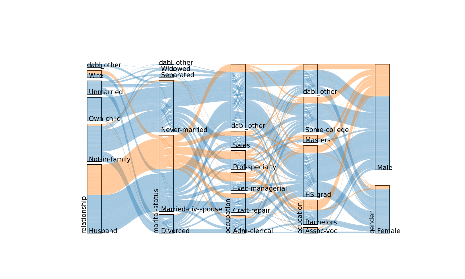
The ‘sankey’ plot is even busier, as it combines the features of the ‘count’ plot with an alluvial flow diagram of interactions. By default, only the 5 most common features are included in the sankey diagram, which can be adjusted by calling the plot_sankey function directly.
plot_classification_categorical(data, target_col='income', kind="sankey")
Total running time of the script: ( 0 minutes 11.351 seconds)